This article is based on a series of virtual and in person customer workshops we ran in 2025 for Tenzo users that wanted to level up their bespoke report building skills and get inspired by the cards shown. This article details how the cards work so that you can use them as a template for your next bespoke report in Tenzo. If you have not yet built cards or familiarised yourself with building custom calculated fields, we would advise you first start with our “Card Creator 101: Master Article with links” article
To get the dashboard with all of these cards added to your Tenzo environment, please drop support@gotenzo.com an email requesting access to the “Supercards Dash”, and we will get it added.
This article is designed to help you use custom calculated fields to customise the way you view your data, with practical examples we hear from our customers on a regular basis
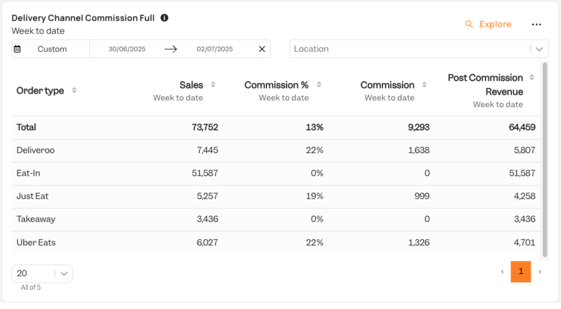
The first two cards show you how to add bespoke commission percentages to the various Order Type sales channels and then shows the subsequent simplifications into a bespoke set of “Custom Order Types”.
The methodology shown here can be applied to almost any of the available dimensions in cards where the order types could be substituted with Location, Category, Item and many others.
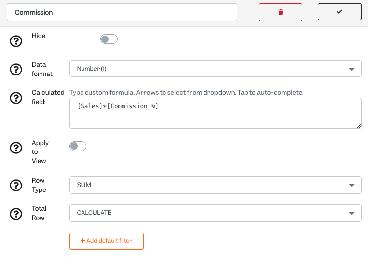
Card 1: Adding Commission Percentages
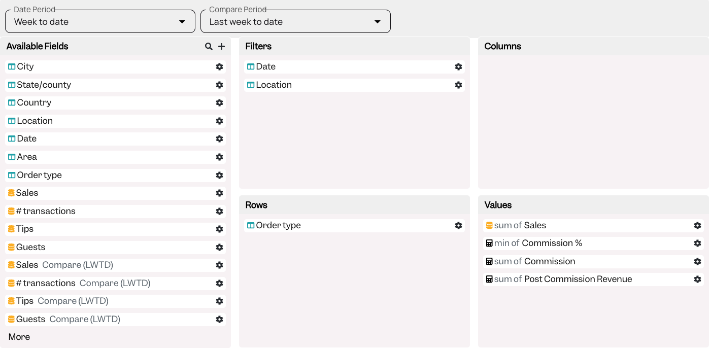
Below you can see the rows and values used in the card:
Here is how the “Commission %” is attributed for each of the order types. Presently you can have up to 6 consecutive “if” arguments on a single calculated field. You need to ensure the Row Type is set to “MIN” and Total Row to “MEAN” for it to work as expected.
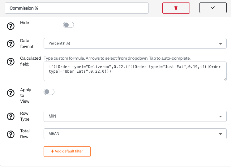
Here is the Calculated field:
if([Order type]=”Deliveroo”,0.22,if([Order type]=”Just Eat”,0.19,if([Order type]=”Uber Eats”,0.22,0)))
The Commission is calculated using the following formula:
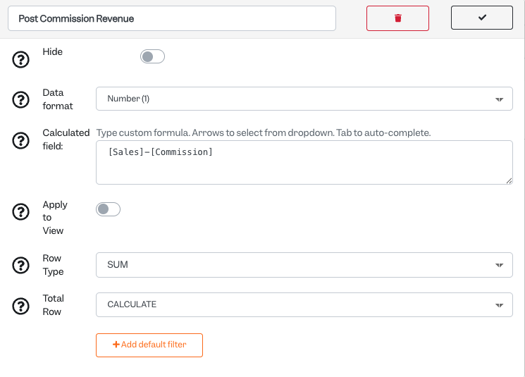
The Post Commission revenue is then calculated using the formula below:
Card 2: Combining Revenue Streams (can be applied to divisions, categories, etc)
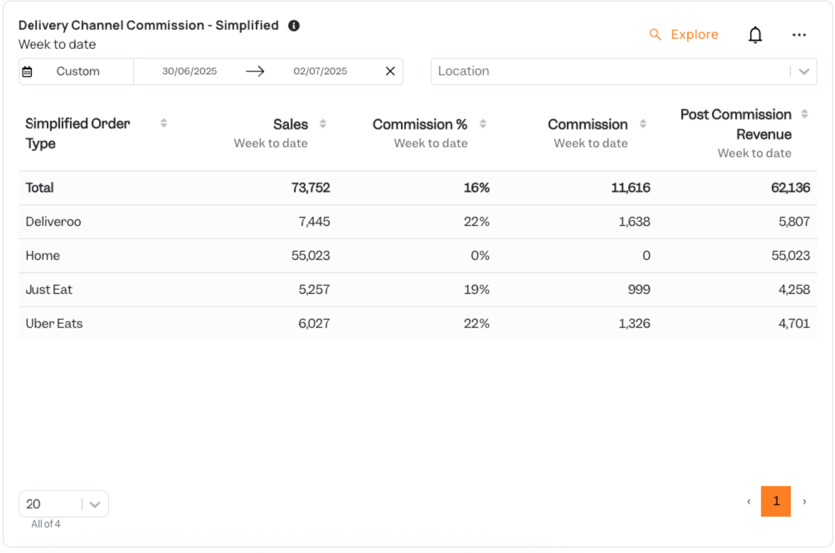
In the second card we want to combine our “Eat In” and “Takeaway” order types into a single “Home Order Type”. In order to do this we are making our bespoke “Simplified Order Types”.
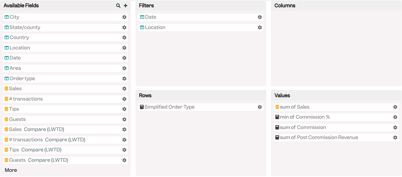
The “Simplified Order Type” is implemented in the following way:
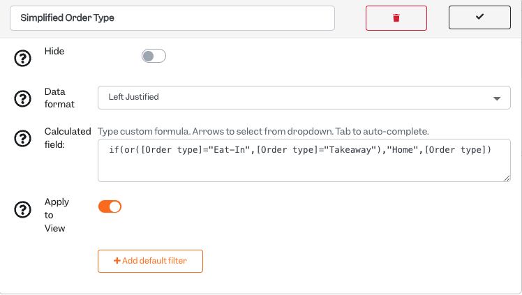
- The data format is set to “Left Justified”
- The Calculated field is as follows: if(or([Order type]=”Eat-In”,[Order type]=”Takeaway”),”Home”,[Order type])
- The logic is that if the order types are either Eat In or Takeaway, we shall simply call it “Home, but for all others, we want to see the known/available order types
- Apply to View is toggled on; this ensures that the filtering is applied before the data is aggregated and shown on the card
- You can use this methodology on any of the available dimensions within a given card view to re-name and do bespoke groupings
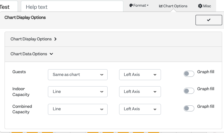
Card 3: Hourly Guest Count Measured Against Capacity
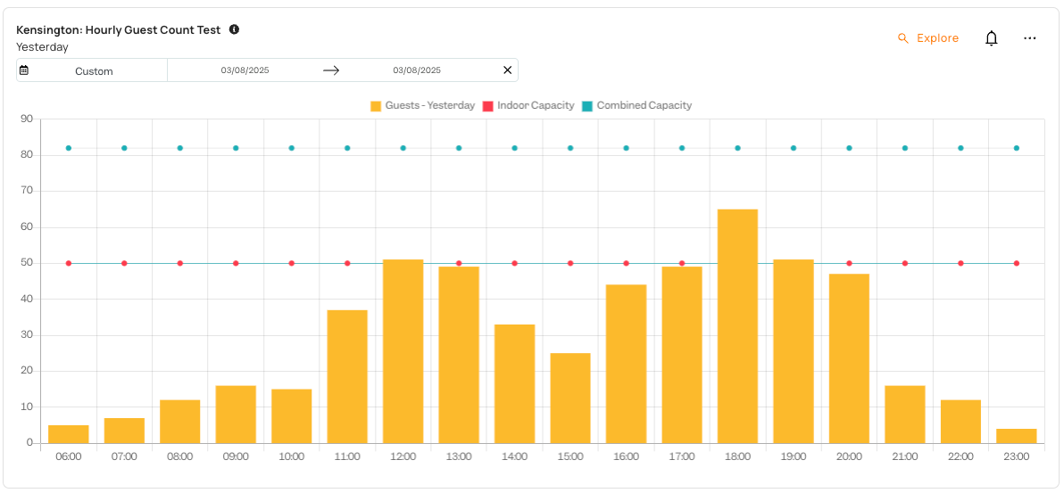
The card above utilises a simple concept, a single venue can only have so many guest safely within a given time, so there is a line representing this capacity. In our “Kensington” example, they have an outdoor terrace which is open on day when it does not rain, so it is shown as a combined indoor plus outdoor capacity.
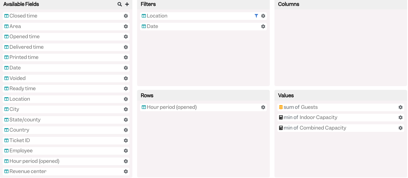
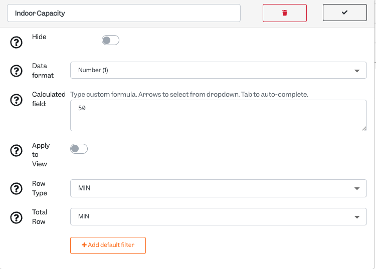
The capacity is a custom Values field with the following setup with Row and Total Row types set to “MIN”:
The Chart Options within this Bar Graph under “Chart Display Options” forces the Indoor and Combined Capacities to be displayed as a Line:
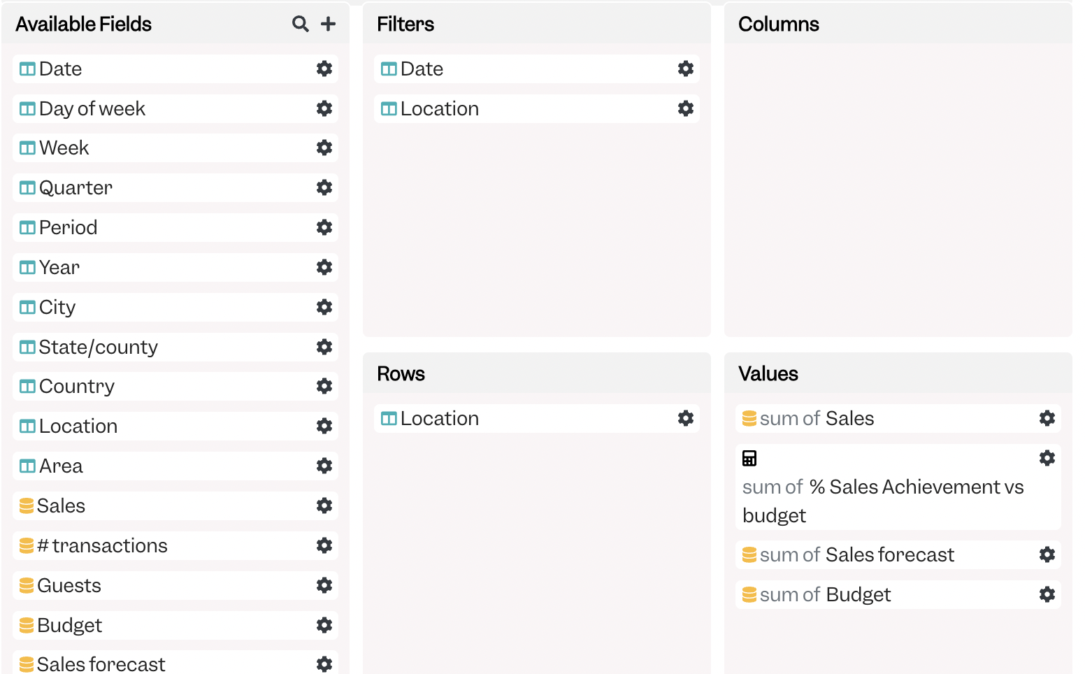
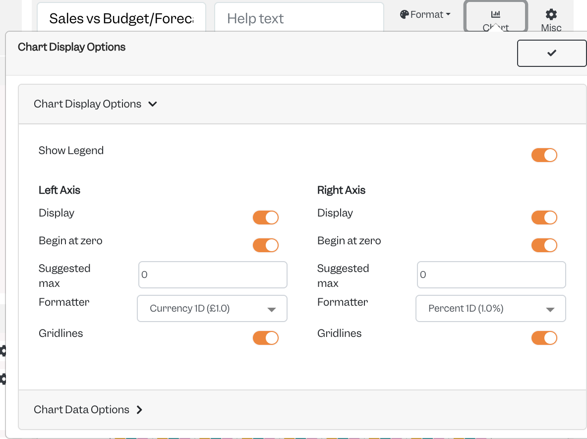
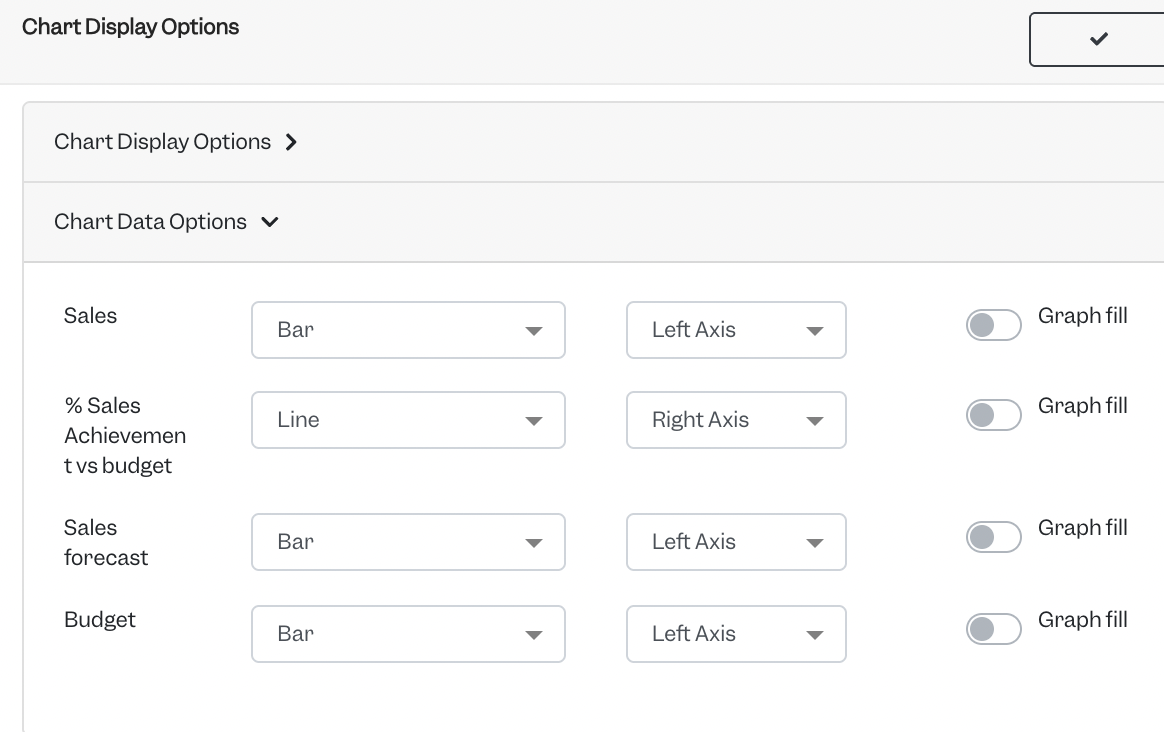
Card 4: Sales, Budgets, Forecasts all in one spot
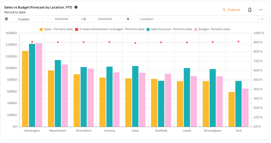
Many Tenzo customers like to employ both, long term budgets uploaded into the platform and the Tenzo forecast for benchmarking their operations’ performance. Within our custom card ecosystem it is possible to build a card that will display all three, as well as a % achievement against your preferred one.
The setup is as follows:
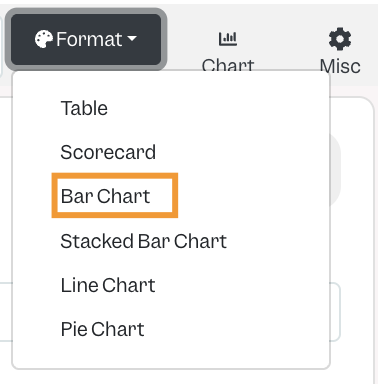
The Card is set to being a Bar Chart
The right axis under Chart Options is set to be enabled and %
And within the Chart Data options the % achievement is set to be a Line on and on the Right Axis:
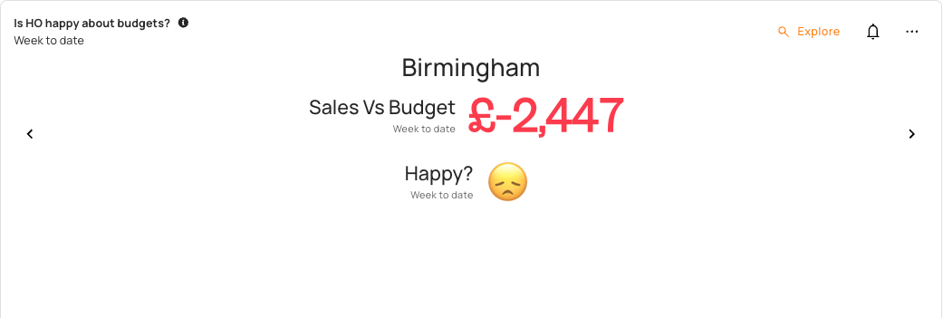
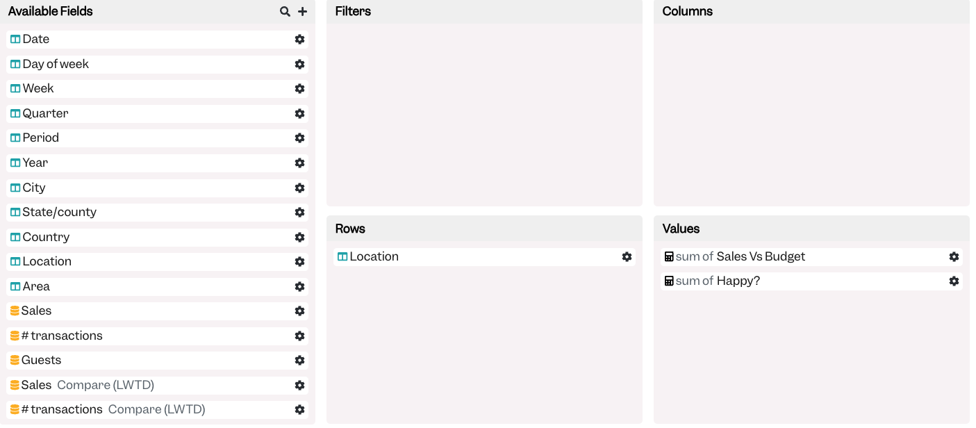
Card 5: Adding Emojis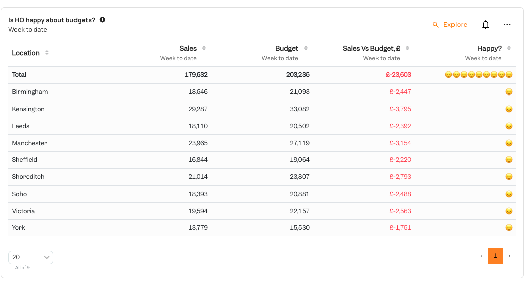
Not everyone is enthusiastic utilising numbers for interpreting the available metrics and results, fortunately within Tenzo you can simplify them into a keyword such as “Happy” or “Sad”, or better yet, deliver it in the universally spoken language of emoji 🥳
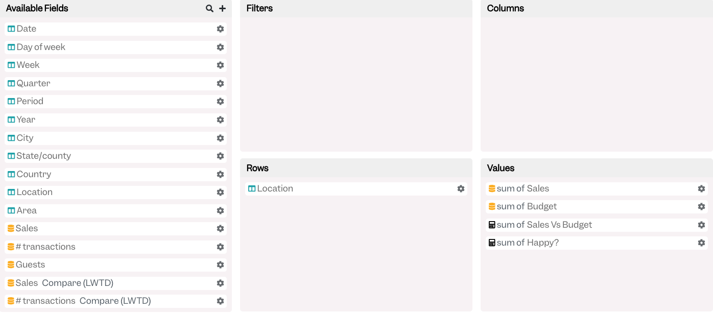
The 🪄 is in the “Happy?” custom calculated field:
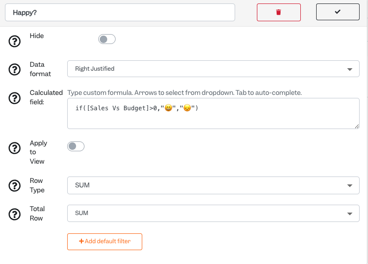
The calculated Field in this instance is set to say that head office will be happy if the delta of Sales vs Budget is greater than zero, whereas if sales are less than the budget, the head office is sad. Ensure your preferred word or emoji are in “”
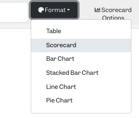
Card 6: It can be made even simpler
If one large table is too complicated, you can always simplify it further by removing fields you are not interested in, and then setting the card format to a scorecard instead of a table:
Format:
Card 7: Not every card has to be complicated to provide a useful insight
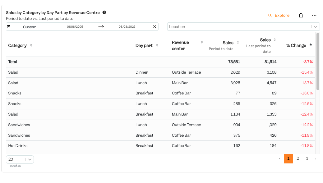
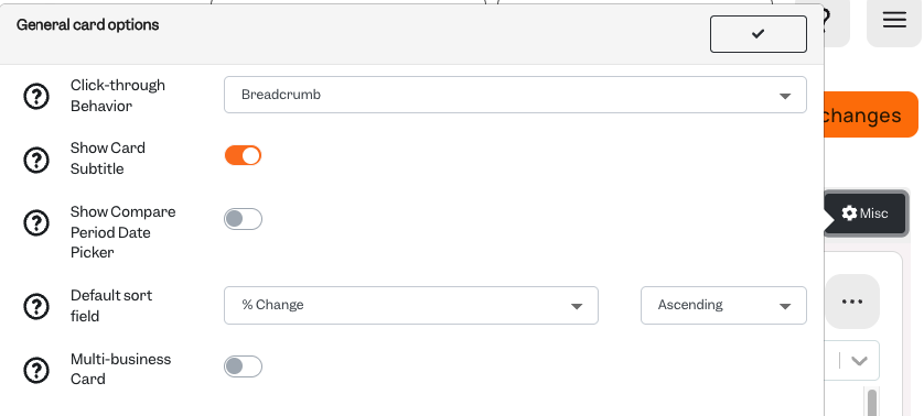
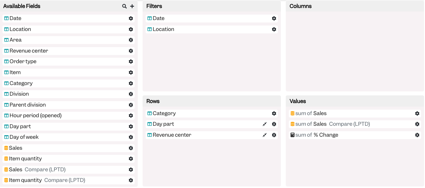
In this card we are taking advantage of our ability to bring in many various dimensions into a report that natively are not readily available in many POS systems, whilst having all of the necessary data there. In this case we are bringing in the categorical item dimension with product categories, the revenue centre dimension to know where the sale took place, as well as day parts to know when the sale took place, and then comparing it to the previous period to date to see the biggest % Change sorted worst to best. In this case Salad sales during dinner at the Outside Terrace are our biggest drop.
Under “Misc” General card options you need to ensure that our % Change field is set to “Ascending”, or if you would prefer to see biggest revenue growth contributors to Descending.